Since tablets and mobiles have begun their onslaught…responsive web design has been a new buzzword. It means that web pages automatically redesign themselves, to work with whatever device is used to access it with. Great! Well, in theory, but we do have to adapt our work to this new revelation.
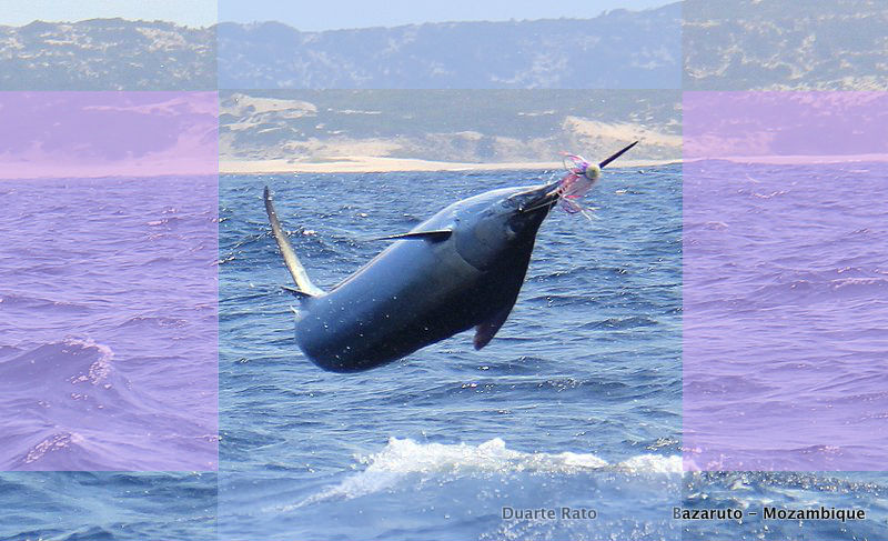
Some of my clients are super photographers (Read Captain Duarte Rato), and they work to certain parameters, when framing and taking a shot. They are all about impact and filling the viewfinder with action, telling a complete story – often times using powerful lenses to get right into the mix.
Telling a story with your single frame photograph is what it’s all about. And then a responsive web design gets hold of your perfect image!
Firstly, most of us and our ways prefer landscape shots. It’s the wider perspective that adds dynamism and it tries to emulate how we see things every day. Spaces are used in telling the story…and the wide shot can tell a lot more than the portrait – especially on a landscape screen.
The incredible rule of thirds, throws the important part of the picture – the subject – into either a corner, one side, or top or bottom stripe, and sometimes, the centre.
Now a responsive theme has to re-render that image, to work in landscape, and in portrait. And this is how great images get sliced into pieces.
The solution. Yip. But some ain’t gonna like it…frame your shots like this…
…or choose shots for your full page slider website – that focus the subject in the centre.
One more thing – full page responsive sliders achieve far more impact than any other layout, but there is even a second trade-off. Since we are loading the highest resolution we can to cater for big screen presentations and even retina displays (the internal workings between device and server decide the resolution finally delivered), it makes good sense then to choose uncluttered imagery, especially backgrounds – and rather focus your available reolution/bandwidth available, on that subject in the centre of your shot. This makes a huge difference in the size of the file. Blurred backgrounds are highly recommended!
Doing this right can cut your load times incredibly.
Choose your full screen responsive slider images wisely!
Any questions to umzimkulu@gmail.com
Next: Full screen video websites…
Umzimkulu Turtle Trap featuring HUGO Fishing #ugu #anc #municipality #bridge #umzimkulu Umzimkulu Turtle Trap featuring…
FULL Umzimkulu Bridge and AMAFA Update by The Sardine News #ugu #transnet FULL Umzimkulu Bridge…
Big Seas for Big Fish: Brusher by Anil Singh at Anerley reports Ian Logie #prawn…
The “Big Three” problems in South African Fisheries by Anton Kruger The “Big Three” problems…
Reel Steve Reporting From Port Edward 17 Sep 2025 #kzn #storm #seas #ocean #conditions Reel…
SARDINES at Anerley and Port Shepstone PLUS Bridge Kulu Update #kzn #ocean #conditions #report SARDINES…
This website uses cookies.
View Comments
Very interesting Sean and hope people take note of your very good ideas.